Diversity – Our team is multidisciplinary and distributed. It comprises a visualisation designer (VIC), a data engineer and two water scientists (ACT), and a remote sensing researcher (QLD).
Functionality – We conducted face-to-face design workshops to sketch out the shape of the tool, and identified the key functionalities required to mitigate the long reporting time.
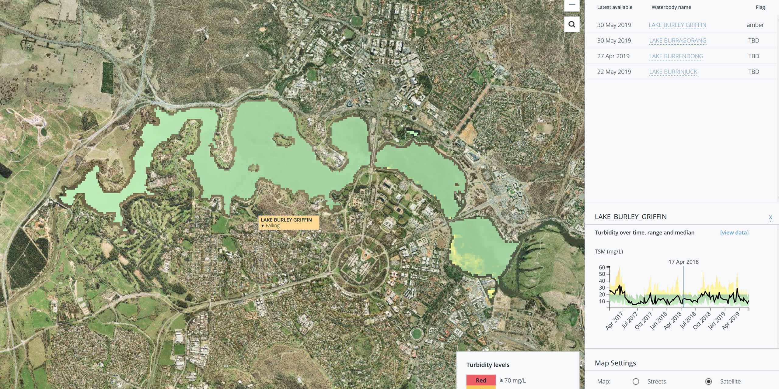
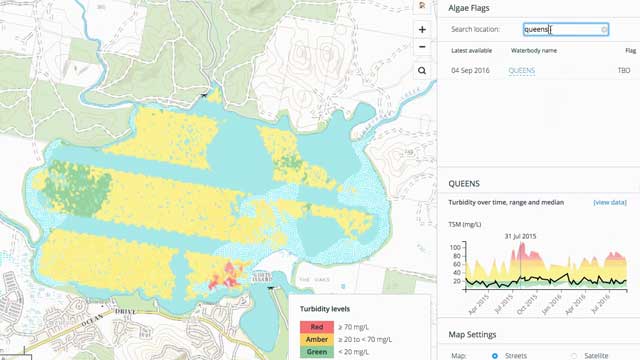
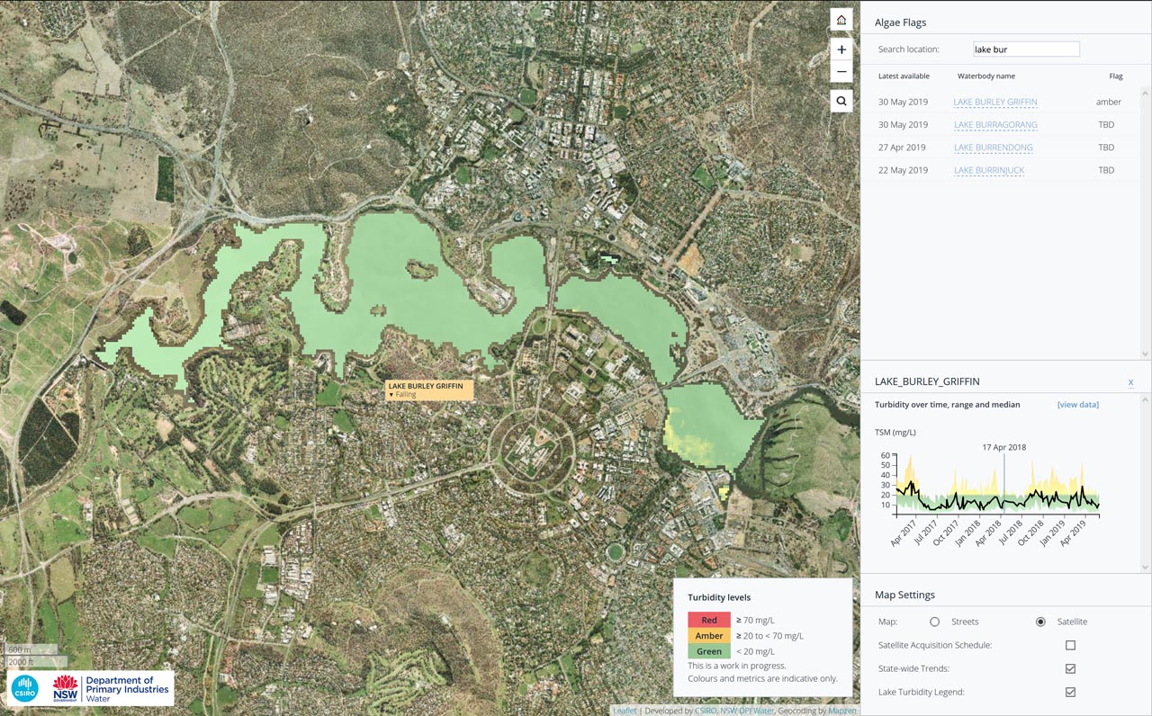
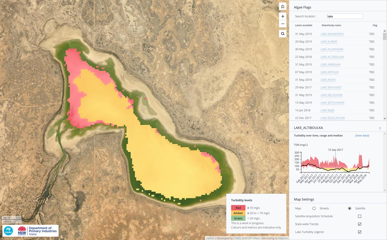
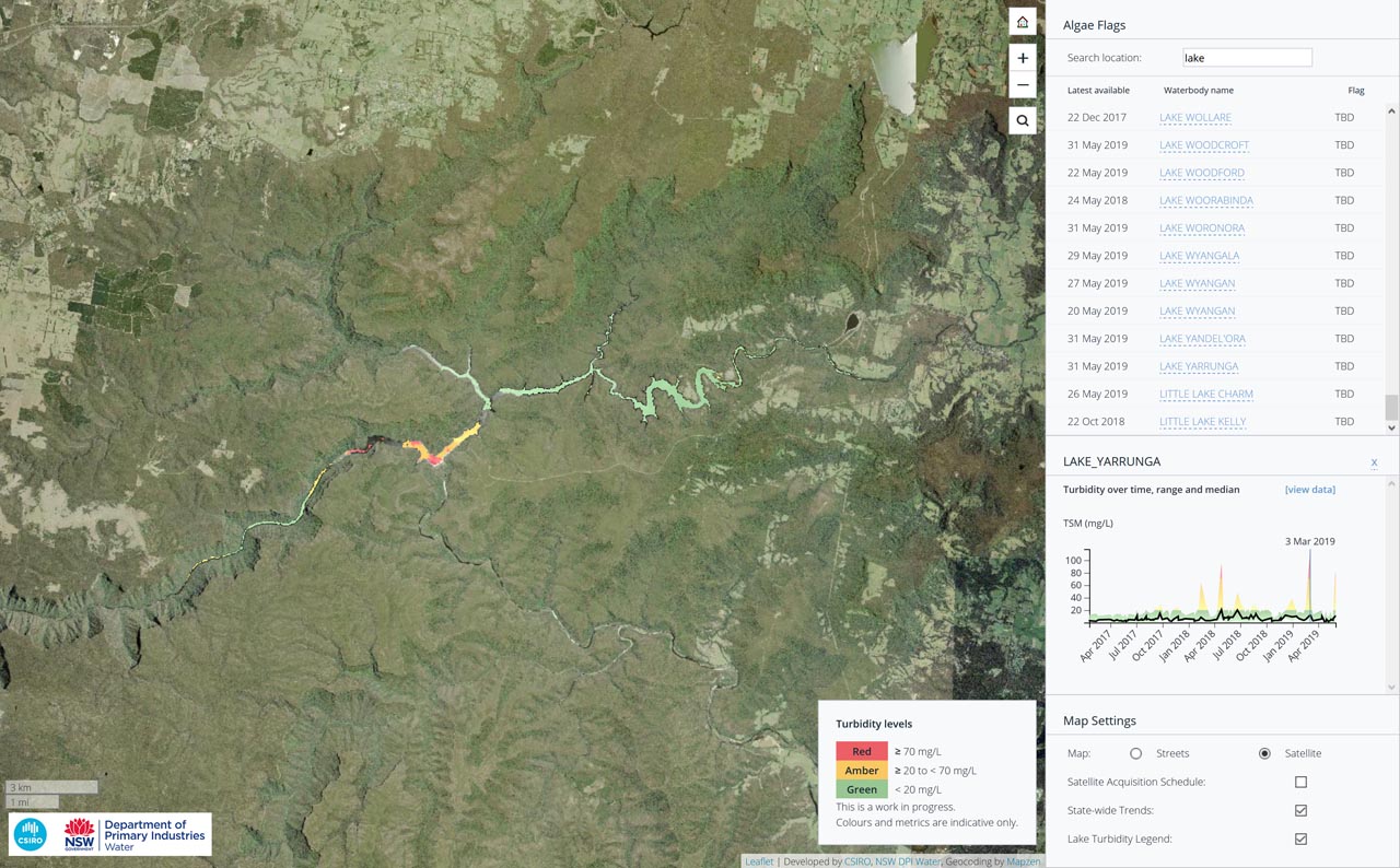
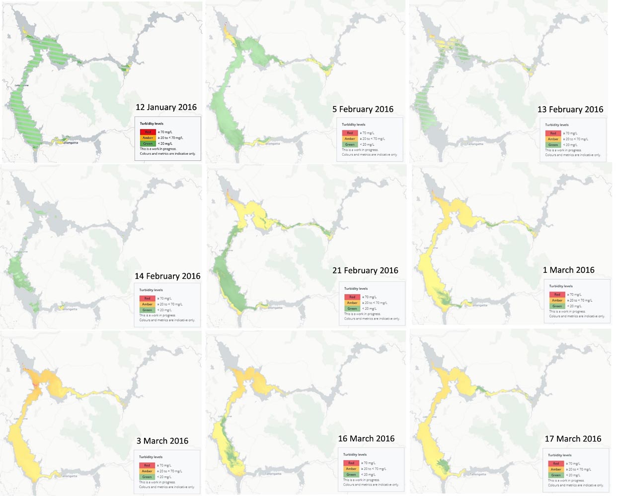
Aesthetics – The user interface adopted a minimalistic approach. It highlights water health as the first priority. The visualisation leverages the conventional red-amber-green traffic light for ease of understanding.
Overall: The system enables a higher water safety, quality and environmental sustainability in Australia.

