Reminiscent of the iconic simplicity of the recycling symbol\’s three R\’s—reduce, reuse, recycle—the idea for the brand came about by introducing a fourth… return!
The U-turn arrow is both immediately recognisable and effective at communicating the brands core, sustainable purpose, that is, returnable and refillable everyday products.
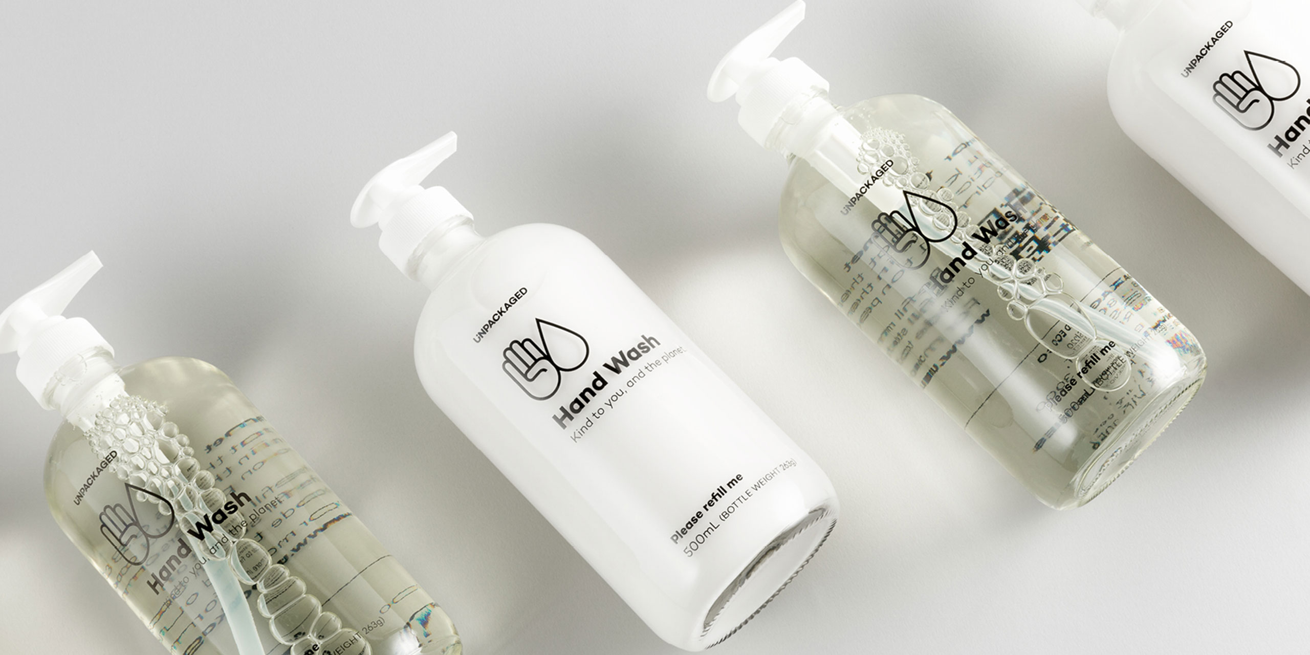
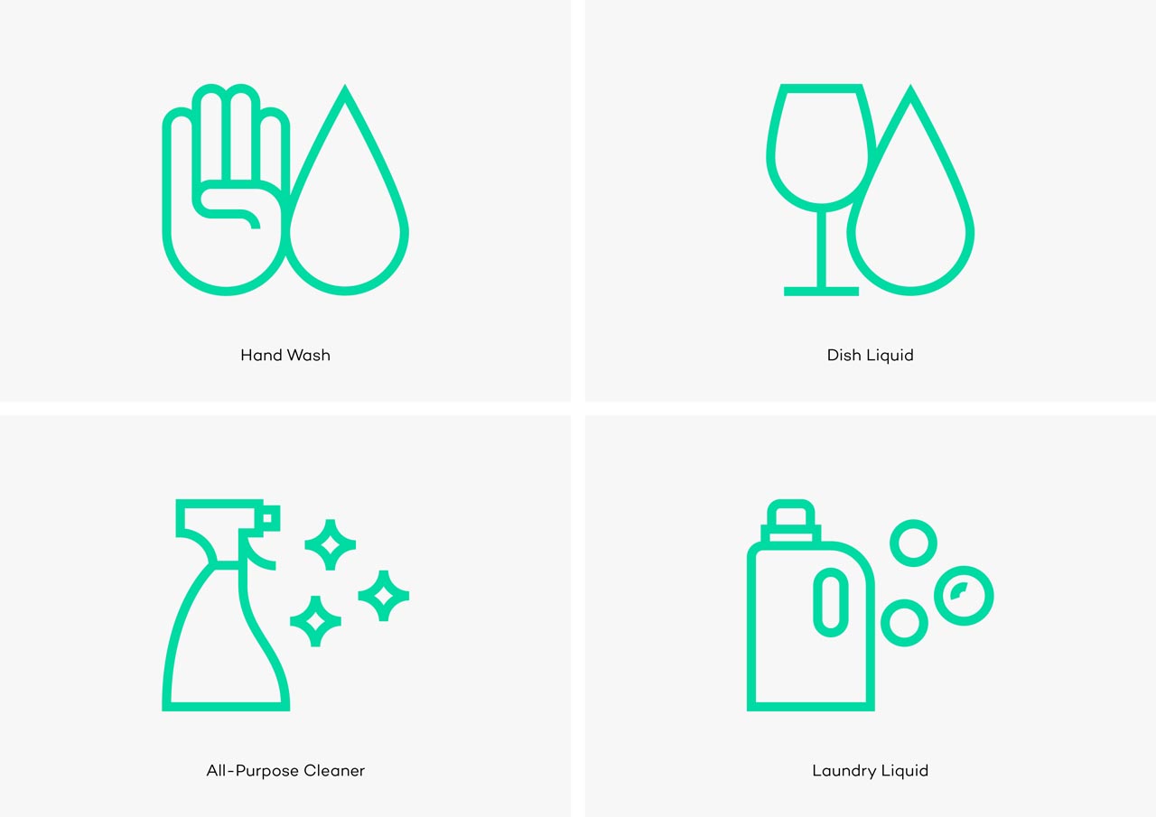
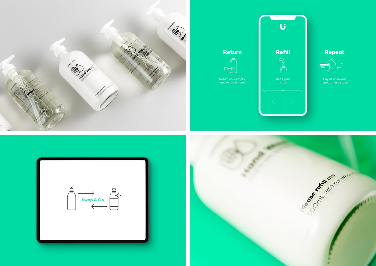
Communicating the unique logistics of the brand was central to its success. As such, a core consideration was to create a distinctive visual language to ensure consumers were clear about the brands reason for being. All touch-points from the brand mark, packaging and in-store communications were crafted with this in mind.

