

The work that Something™ produce is truly transformative for their clients. They embed culture at the heart of brands, to connect people and ideas. While they transform their clients brands we needed to ensure that their brand was built upon a strong system, had identifiable features and was uniquely memorable.
Finalist 2020
Something™ Brand Identity
Motherbird / Something™
Build a brand that truly captured the essence of what they do.
Something™ are a creative content agency with offices in London and Byron Bay. They work with some of the world’s largest and favourite brands to produce and activate campaigns, building brand awareness and recognition.
Having gone through a transformation and growth period, we worked with Something™ to build a brand that truly captured the essence of what they do.
Design Excellence
Design Impact
The repositioning, strategy and rebrand provided Something™ with a brand architecture that clearly differentiates and communicates their multiple business facets. The brand identity itself has given them a unique point of difference within an incredibly saturated sector, allowing them to stand out, land big commercial clients and build culture through content while staying true to their ethos of doings things differently.
Design Transformation
In a rare opportunity to produce a brand identity that is highly unique, this project pushes the boundaries of design thinking. It’s clever use of psychology paired with language challenges the notion of what a logo is. The worldwide client base that Something™ works with means their brand is exposed to some of the largest organisations round the world… now that’s something.
Design Innovation
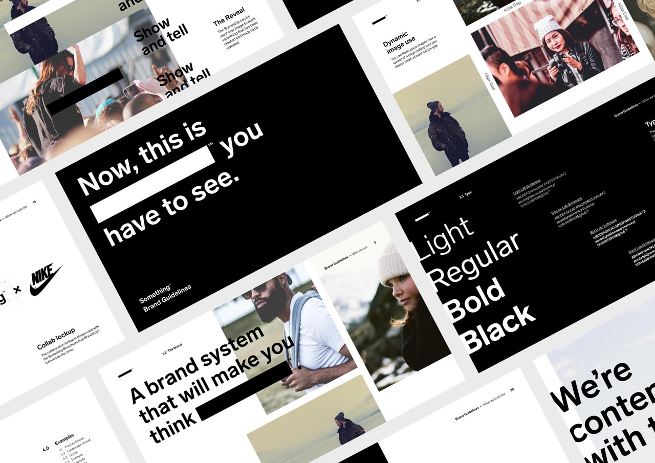
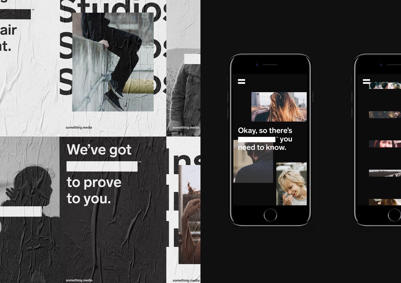
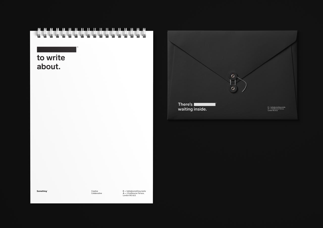
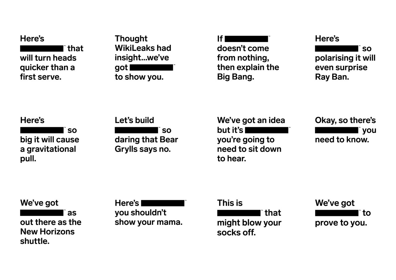
Research shows that we learn far better by doing and participating than watching passively. “Something” — A thing that is unspecified or unknown. It can mean anything or nothing at the very same time. Through this logic we decided to reinvent the expected delivery of a logo. Typically, you see a logo, identify it and make associations, rarely saying the brand out loud. By censoring the logo and incorporating it into language we encourage the audience to fill in the gaps placing Something in the subconscious through the conscious.
Other Key Features
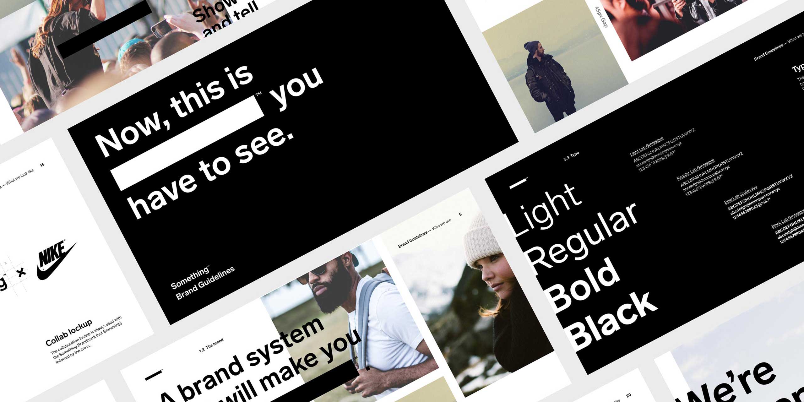
A detailed brand book was developed so that anyone, anywhere can understand what Something™ stands for and how to use their brand with precision and flair.
The team worked with type foundry Letters From Sweden to create a custom version of Lab Grotesque to address the optical illusion of the typeface weights appearing slightly lighter when used as black text on white as opposed to the reverse.
Meet the Jury
Entries are judged by a panel of national and international design experts representing the diverse range of design disciplines showcased by the awards.
View the Awards JuryEntering the Awards
The Awards are free to enter for eligible Victorian designers and architects with submissions across eight design categories.
Learn more about the guidelines and process
×
Type on the line above then press the Enter/Return key to submit a new search query