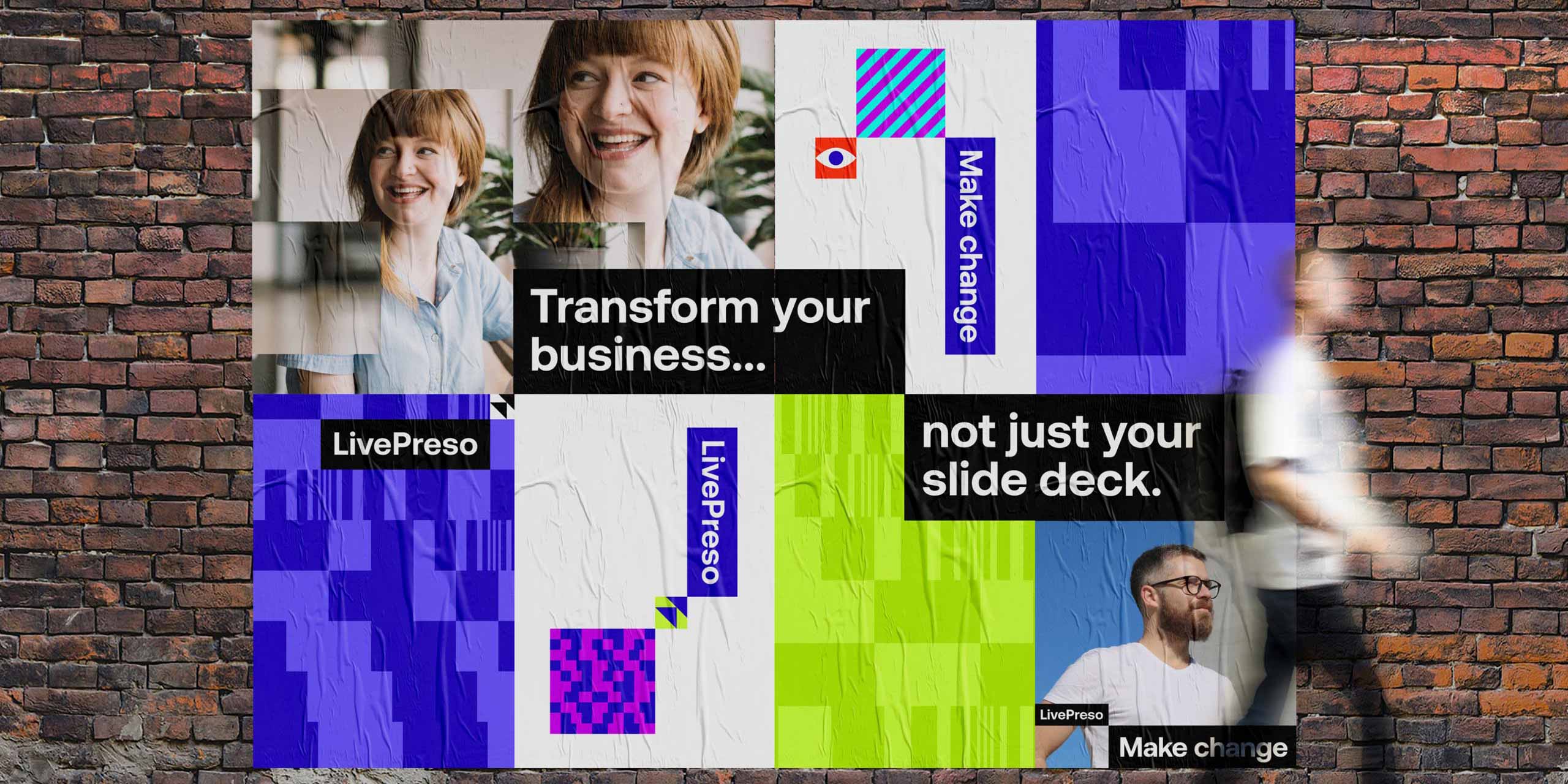
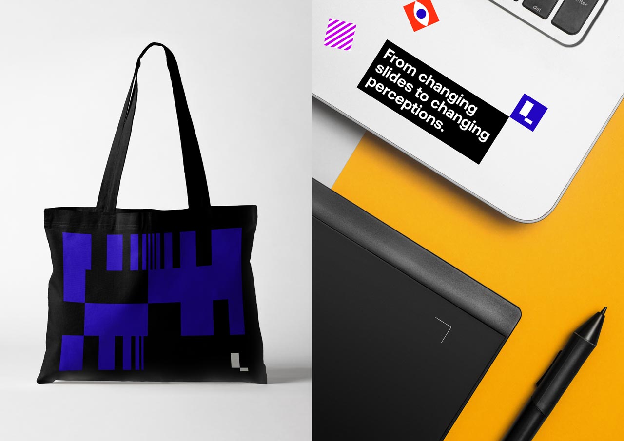
We created a new credible single-minded brand position; ‘Make Change’
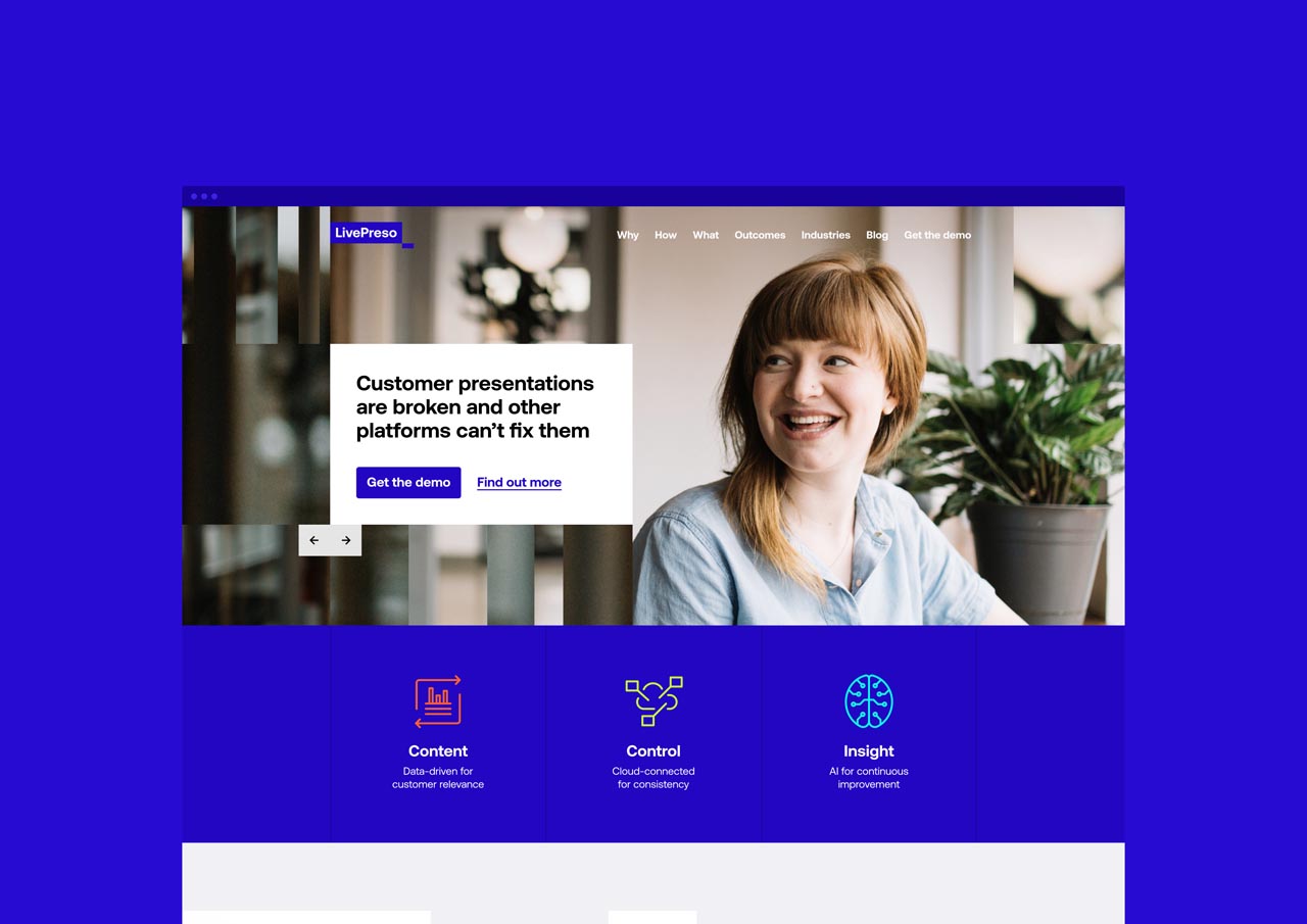
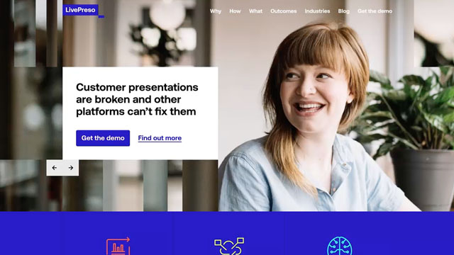
We were asked to help SalesPreso rebrand to LivePreso. LivePreso is known for its smart presentation software that allows customers to dynamically generate presentations. Through the process of research and strategic thinking, we identified a hidden value that they often provide; the ability to help clients transform their business.
We identified the perfect target audience as a customer who wants to make a change from within the business but needs to be able to tell the right story. We created a new credible single-minded brand position; ‘Make Change’, and we used this organising idea to inform our visual language.