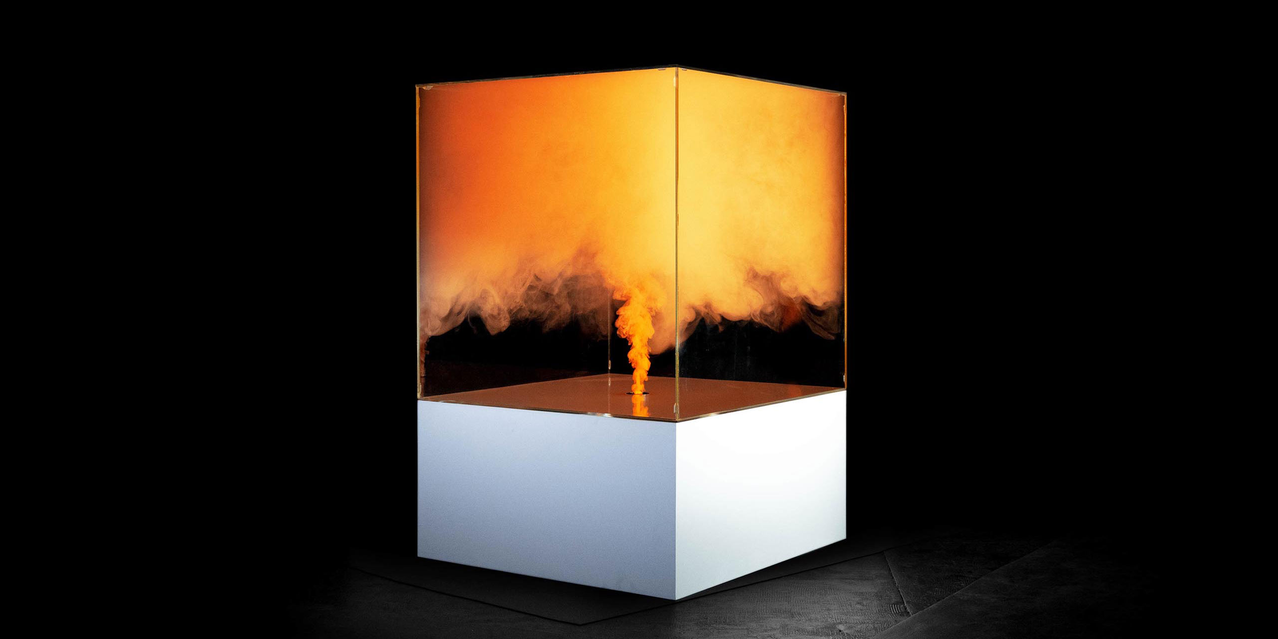
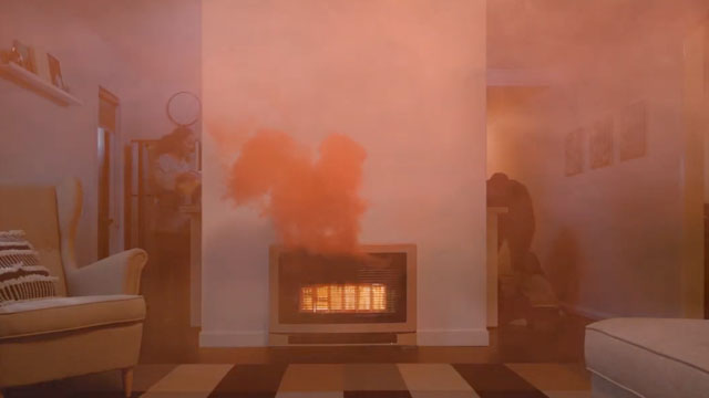
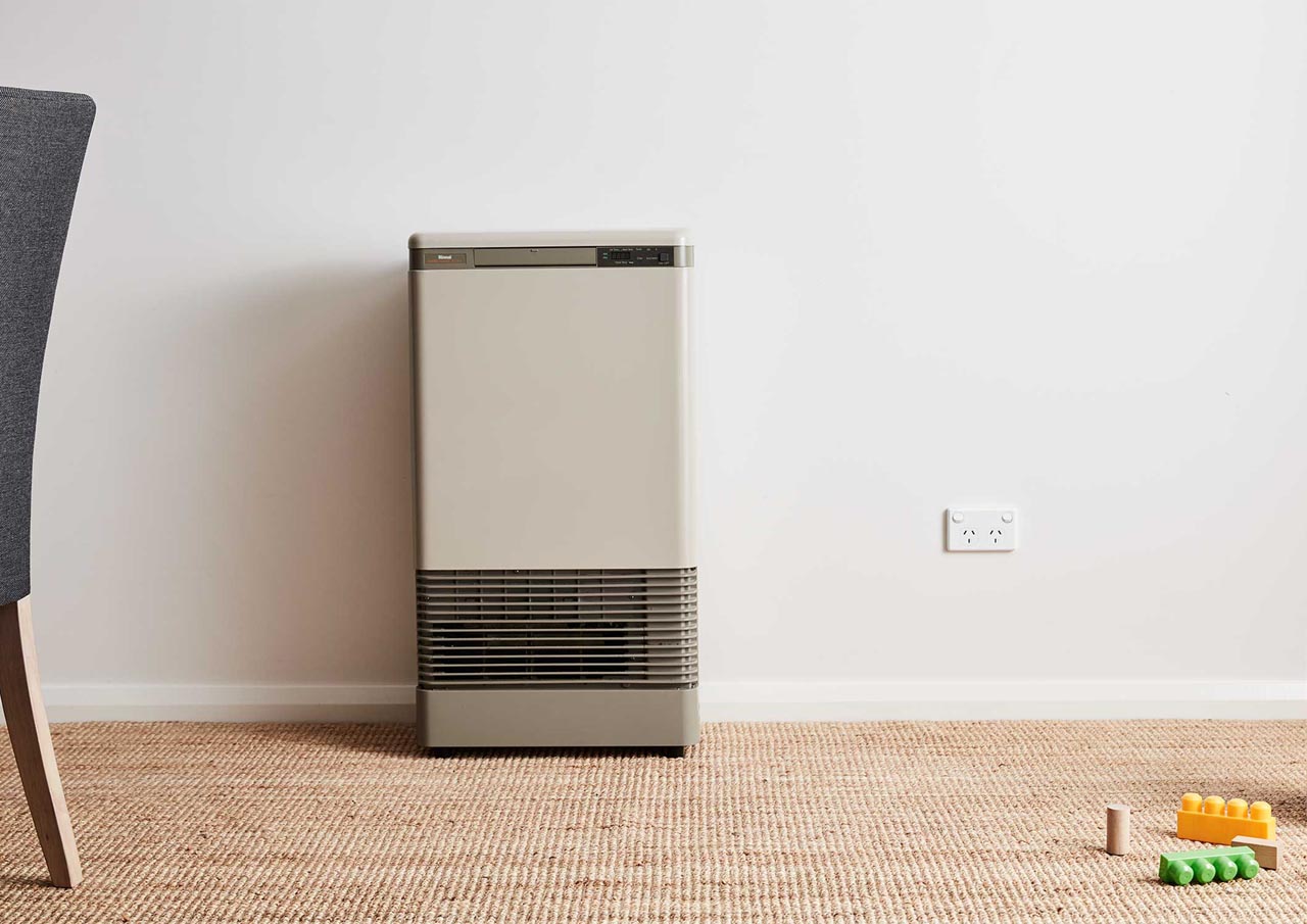
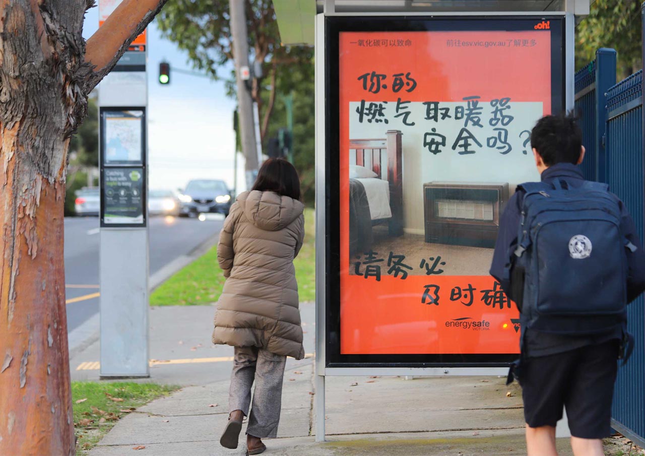
Clarity and access were paramount in driving the creative direction of the campaign. So was visual differentiation and aesthetic cohesion across a number of channels.
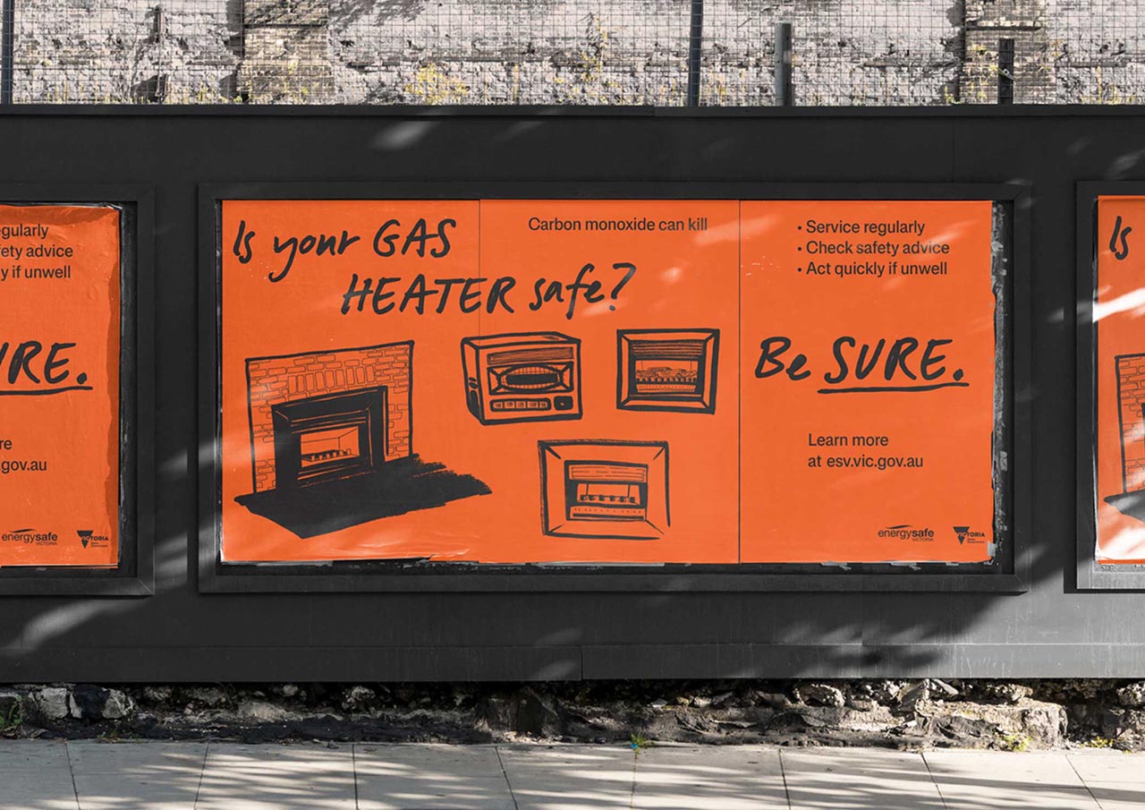
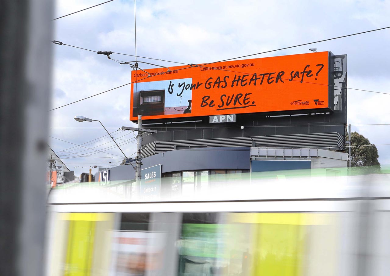
A single, unifying campaign colour was at the heart of the visual identity, along with a play between two typefaces. An imperative, handprinted version of A2 type’s HK Signature, and the more stayed tone of Schwiss. These two key visual assets were deployed across all executions to draw together applications as wide ranging as billboards and TVCs to fridge magnets and shopping lists.

