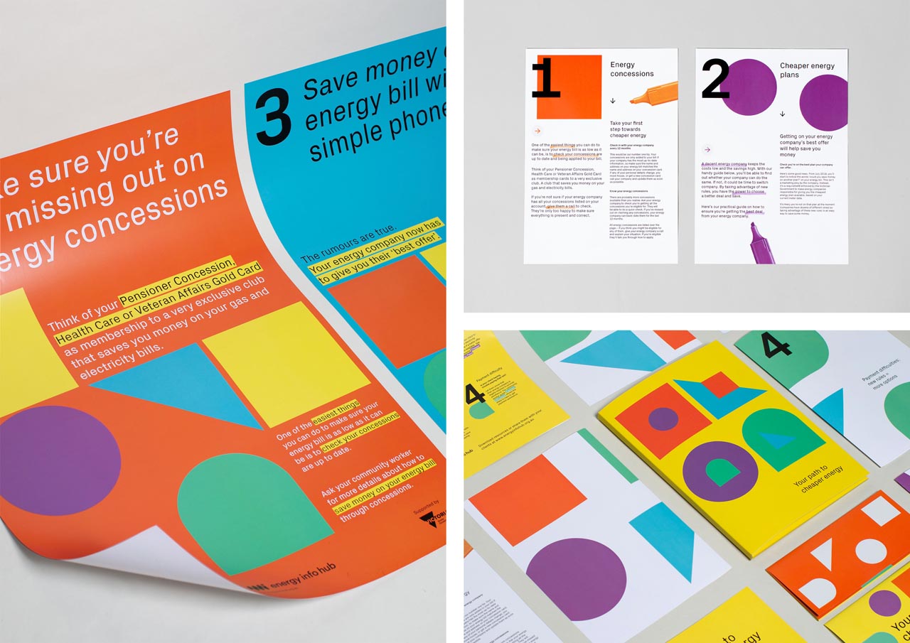
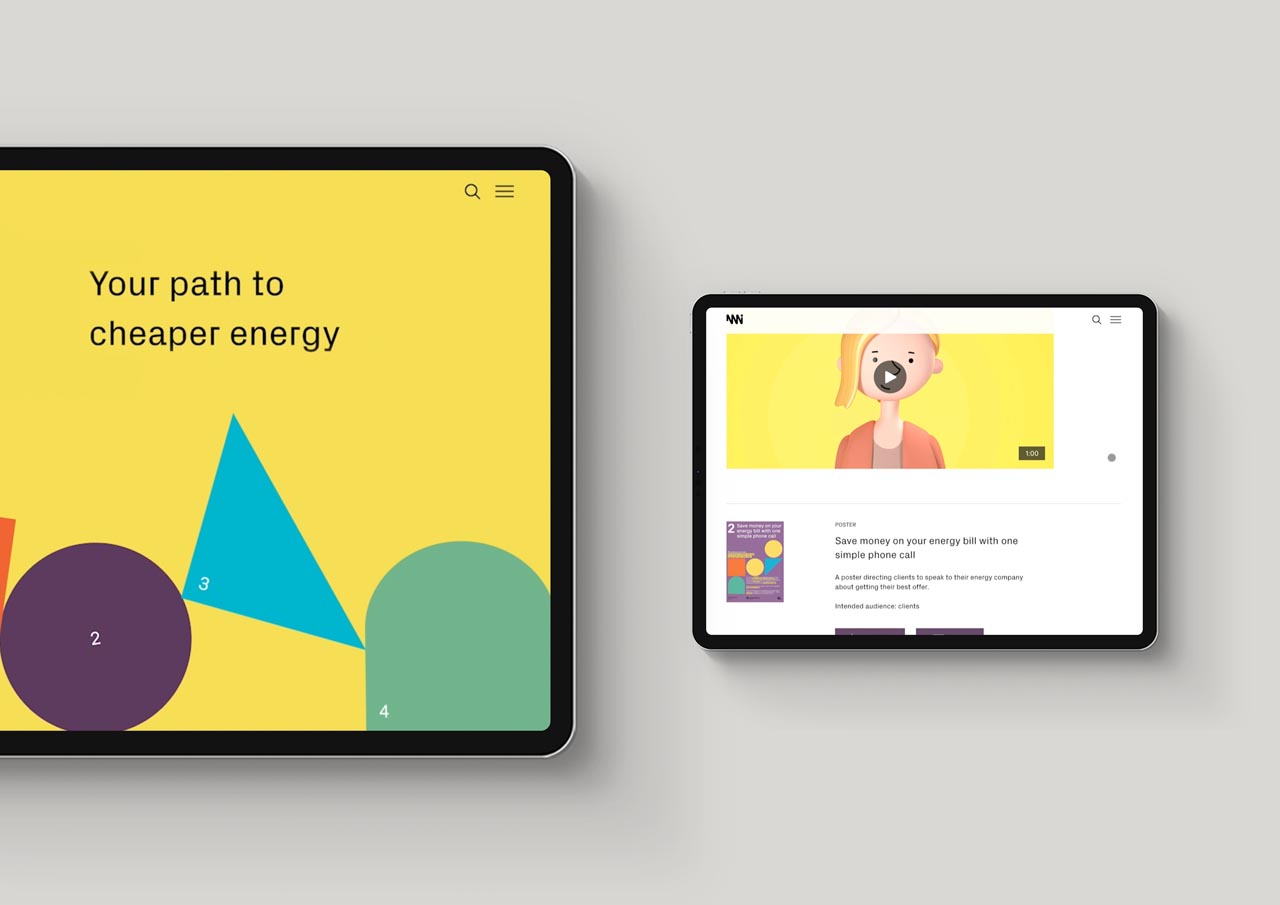
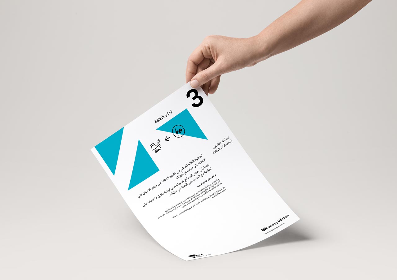
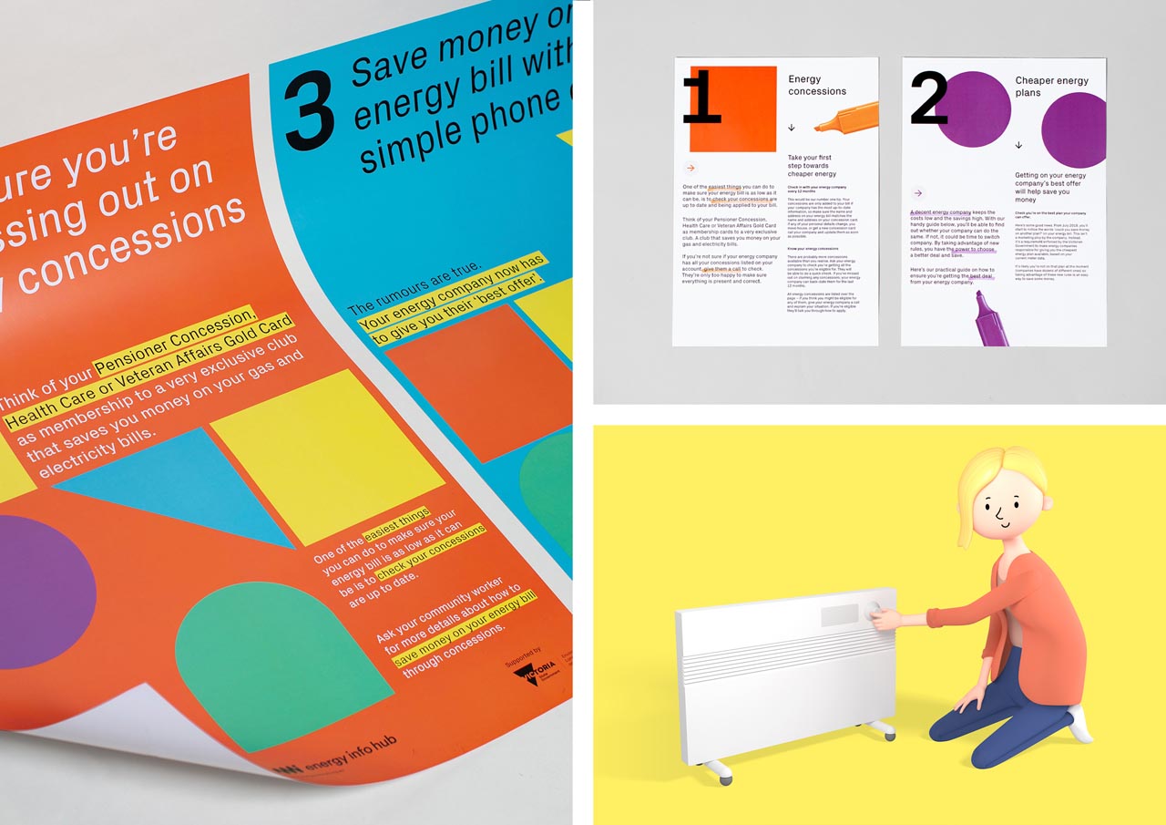
We took the innate positive and simple associations of geometry, and ‘building blocks’, along with oversized numerals to help the audience navigate the breadth of available resources, and effectively group thematically aligned or relevant content.
Bright colours, and typography that was formal but had a quirky detail were used liberally, and at scale to connote simplicity, and ensure accessibility through verbal and visual cues.
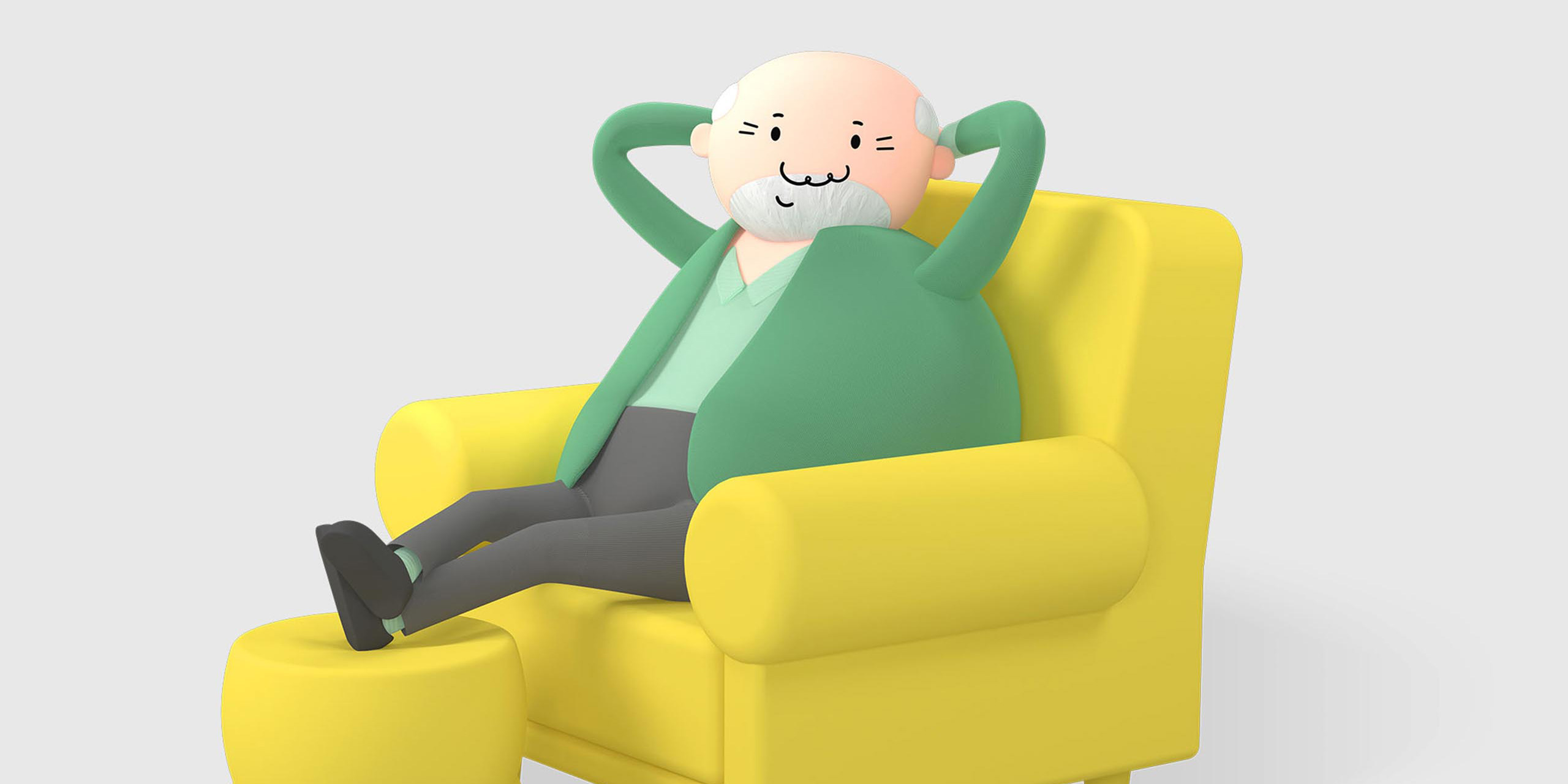
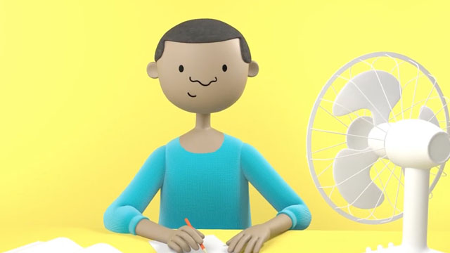
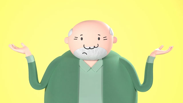
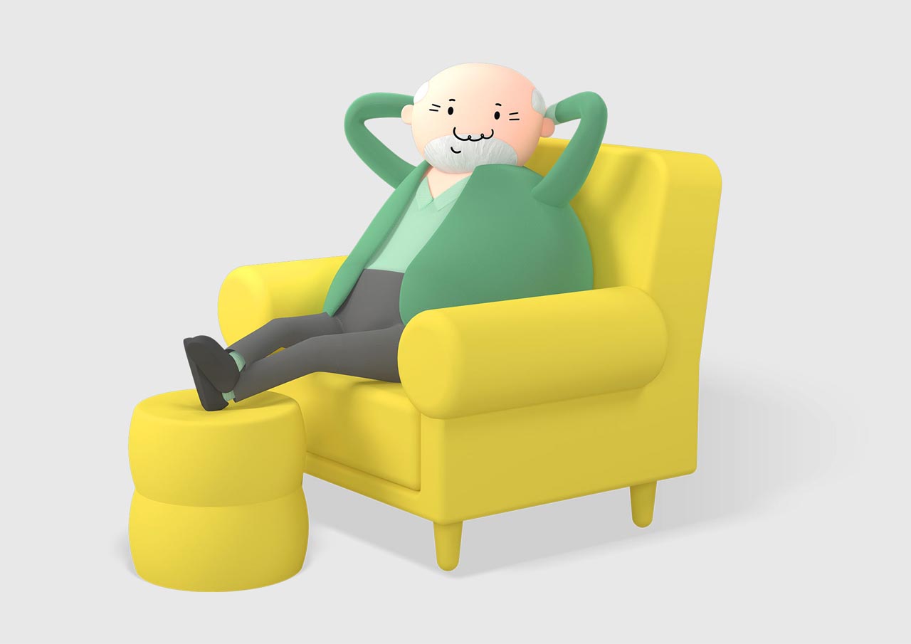
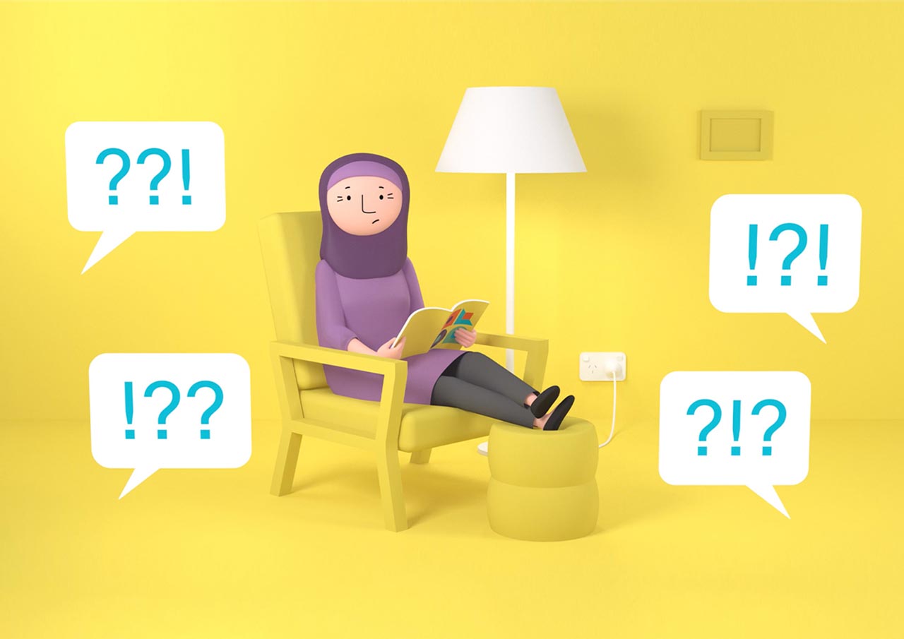
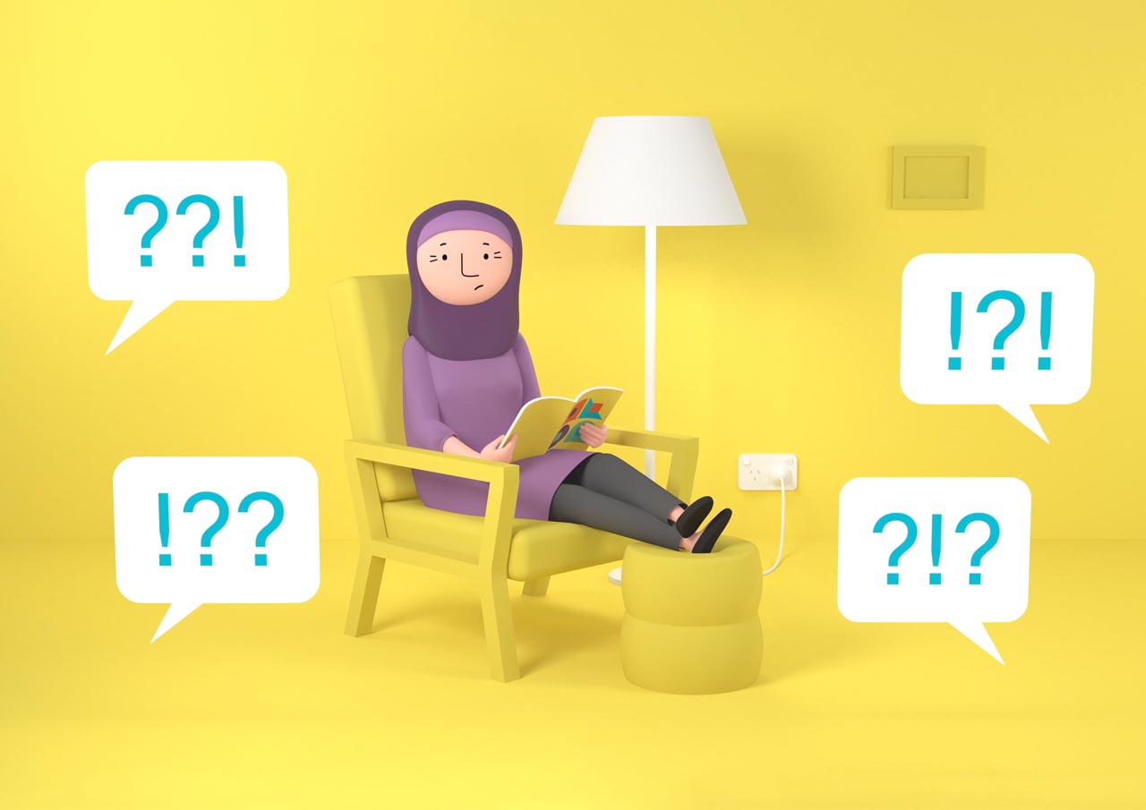
Illustration and character design for animated content was similarly inspired by simplicity, openness and ‘difference’ from expected government norms. With a subtle undertone of experimental cold war soviet cinema.

