Finalist 2019

Pinch Sea Salt

RMIT University

The brief of this project was to design the packaging for sea salt made from sea water off the Great Barrier Reef.

The salt is to be sold at major Australian airports and targets tourists from all over the world who visit Australia. As a designer, the task was to create a name for this brand of sea salt, the logo and its packaging.

Design Excellence

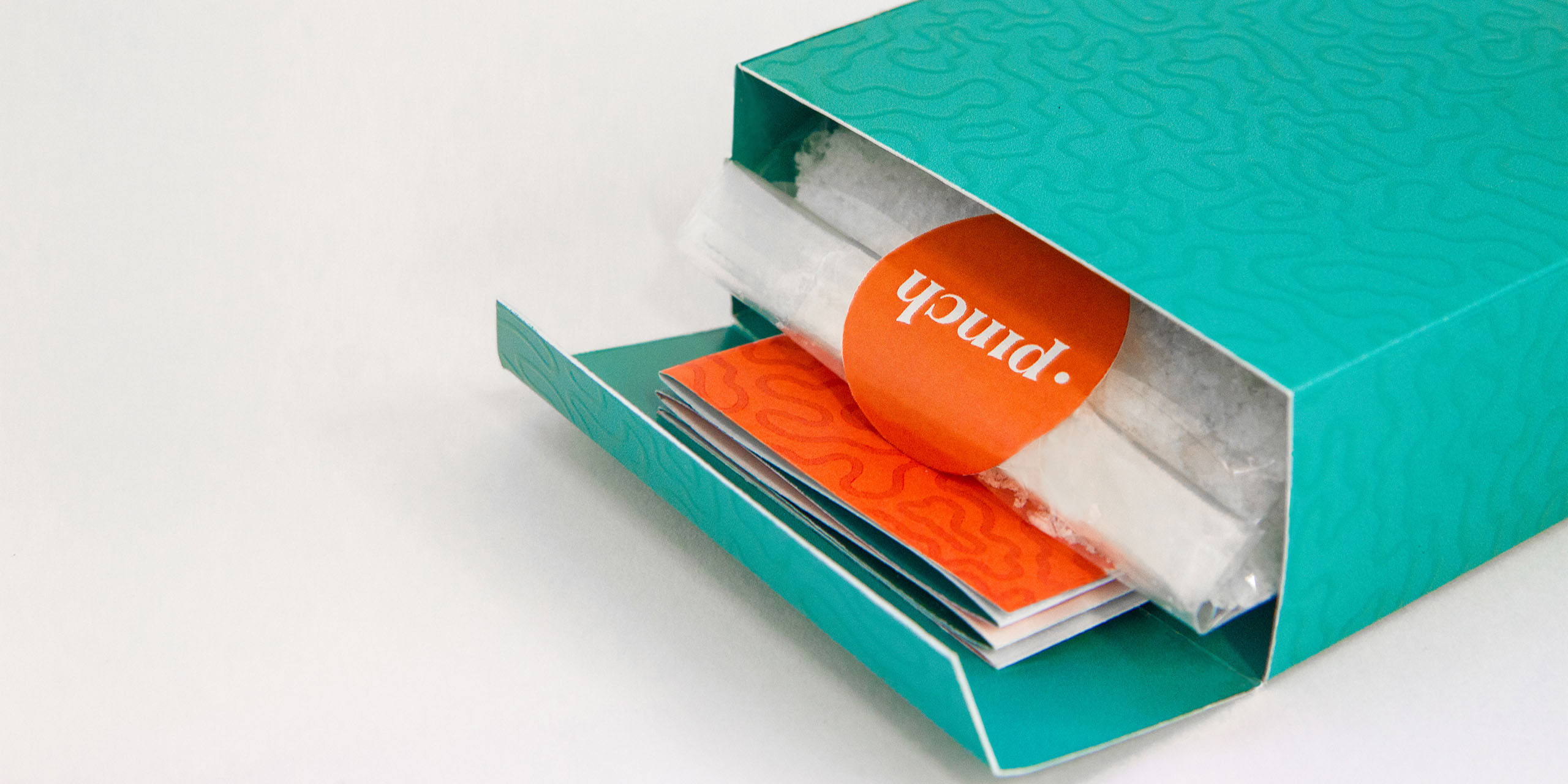
Pinch Sea Salt is inspired by the unique surfaces of coral at the Great Barrier Reef, referenced in the design through simple textural patterns and imagery to create a clean and eye-catching aesthetic. Fresh colours of red-orange, teal and light blue work in harmony to represent the tropical climate of north-eastern Australia.

The circle on the slip alludes to the sunset over the reef, with the bottom half of the circle die-cut to reveal the texture of coral underneath the sea.

Design Impact

As the Great Barrier Reef is a precious ecosystem of Australia, I have decided to include a small pamphlet inside the box that outlines the natural and sustainable process of making Pinch Sea salt. Simple infographics outline the process of solar evaporation, so that consumers can be sure that the salt is 100% natural, organic and ethically sourced.

The reverse side of the pamphlet explains how to enjoy Pinch sea salt in your meals, as it is very much a speciality salt that is best enjoyed as a last touch.

Design Transformation

The packaging for Pinch Sea Salt stands out from competitors through its unique combination of tropical colours, patterns and imagery of the Great Barrier Reef.

By taking such care into making the design of the packaging a very cherished souvenir of Australia, it would hopefully remain on consumer’s shelves for years beyond its purchase.

Design Innovation

As this packaging is designed to be a gift or souvenir for tourists, I wanted to make the opening of the packaging a more special and tactile experience. Once the outside slip is taken off, the slogan of the brand “A little pinch goes a long way” is unveiled intertwined with the textural pattern of coral surfaces.

I have also chosen to use a high build UV spot varnish for the pattern so that the user can actually feel the indentations of the coral (almost like they are holding a piece of Australia).

Student Design 2019 Finalists

Platform

Matt Caldar / Lauren Garner / Olivia Potter / Will Muhleisen and Courtney Brown / Office

Ntaria Design

Nicola St John / Ntaria Design

Gecko Traxx

Ryan Tilley / Gecko Traxx

Levity – Wake Up To Racism

Lois Vergel / Swinburne University of Technology

Lettuce Eat

Maddison Ryder

The Tower of Two Cities

Jack Jordan / Paris Gazzola / RMIT University

Uncomfortable Immersion

Chloe Marcela Coelho

Food Delta

An Ni / Cheng Jie / Huang JiaRong / Kuo Po-Hsuan / Zhai QingYun

Rood

RMIT

Madame X

Yuchen Gao

Inclusive Classroom Furniture

Foursight Architects

Reclaiming Accessibility to Lower-Limb Prosthetics

Royal Melbourne Institute of Technology

Riza

Neal Kaldor / Stella Qingquing Yang / Temitope Adesina / Tutor - Alisa Andrasek & Joshua Lye / RMIT University