


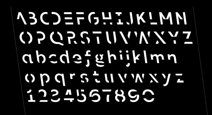

The design excellence of Sans Forgetica emerges from privileging function over aesthetic form. The typeface performs its primary function (memory retention) directly through its design. In this sense the design presents an honest and unambiguous purpose – it works by being read. Its specific design features directly respond to the underlying psychological theories of ‘desirable difficulty’, including the seven degree back-slant and gapping within the letterforms, carefully engineered to preserve the communicative essence of each letter whilst building a degree of \'disfluency\'. Importantly Sans Forgetica represented a collaborative and multi-disciplinary model of design excellence.
Best in Category - Communication Design 2019
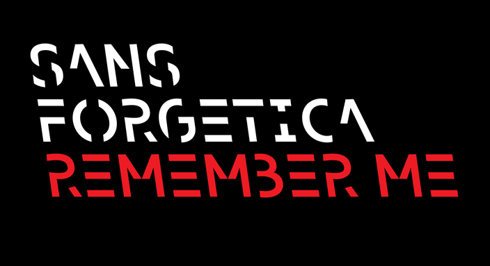
Sans Forgetica
Letterbox / RMIT Behavioural Business Lab / RMIT School of Design
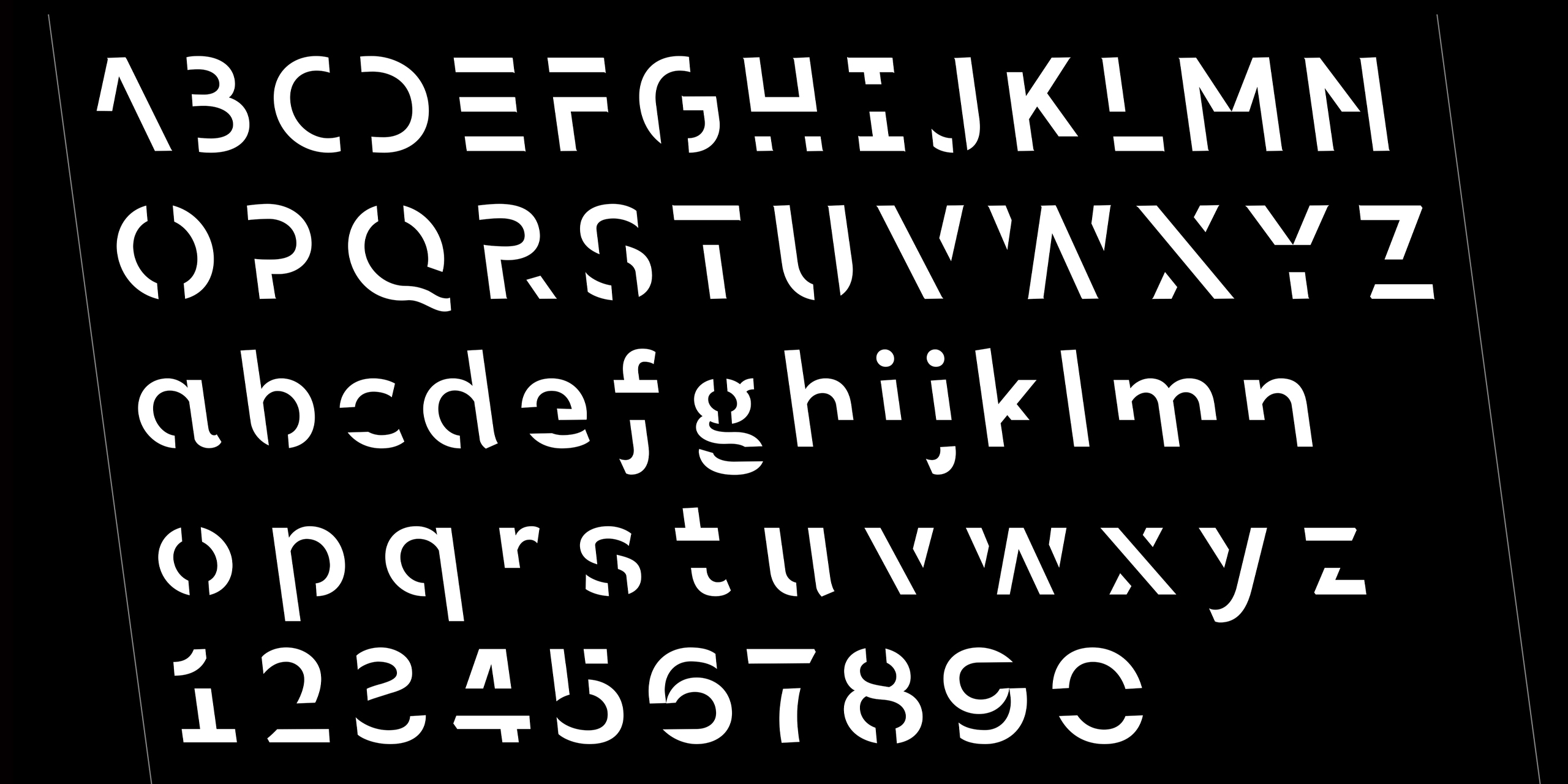
Sans Forgetica is believed to be the world’s first typeface designed using principles of psychology to improve retention of written information.
Designed for RMIT University to assist prospective students with their exam studies, it uses balance, typicality and alignment to subvert many conventional design principles. This distinctiveness creates degrees of ‘desirable difficulty’ causing readers to dwell longer on each word, giving the brain more time to engage in deeper cognitive processing, enhancing retention of that information.
Design Excellence
Design Impact
The impact of Sans Forgetica has been very significant. The typeface was released online as a free download for people to use and test for themselves. This resulted in thousands of downloads of the font as well as its browser extension. Importantly the project had a massive effect of the public understanding of the reading process and memory. Sans Forgetica was covered across media worldwide, attracting over 200 million views through various channels. As well as attracting academic interest and winning several design awards, it is being tested in the context of early childhood education and dementia research worldwide.
Design Transformation
Sans Forgetica is fundamentally transformative. Firstly, the project was created through transforming theory into a fully applied form for public use. Secondly, the design intent of Sans Forgetica is the cognitive conversion of reading into recollection, carrying with it the potential to change people’s lives. This was extensively lab-tested across hundreds of students with positive results, supporting the transformative principles of Sans Forgetica. The free and public access to the typeface also reinforces another key objective of the project – to contribute and transform wider discussions and societal concerns around memory.
Design Innovation
Sans Forgetica is a completely original idea and is believed to be the world’s first typeface created using psychological and design theories in order to help memory retention. The cross-disciplinary project uses familiar material (font software) and a familiar process (downloading the software) in bringing a whole new understanding of how the choice of typeface can potentially effect the recollection of informational content. The design itself is unlike any other typeface because the principles on which it is based come from current psychological research. This new research has yielded a completely new designed form, the very first in the world.
Other Key Features
Sans Forgetica is a model of design excellence and collaboration – built on rigorous research and testing, showing an understanding of the user and the process by which they read and recall information. It advances the design profession, pushing the boundaries between design and our understanding of informational memory. The possible applications of the principles underlying this project across industry, education and commerce potentially effect the design of all textual information. Underpinned by rigorous research from the RMIT Behavioural Business Lab, Sans Forgetica contributes to our collective understanding of memory through a truly imaginative, unique and innovative use of design.
Meet the Jury
Entries are judged by a panel of national and international design experts representing the diverse range of design disciplines showcased by the awards.
View the Awards JuryEntering the Awards
The Awards are free to enter for eligible Victorian designers and architects with submissions across eight design categories.
Learn more about the guidelines and process
×
Type on the line above then press the Enter/Return key to submit a new search query