Finalist 2019

Pentridge Cellars Brand Identity

Liquorice / Pentridge Cellars / Fiona Killackey Consulting / Made Visual

Her Majesty’s Prison Pentridge has defined the landscape of the Melbourne suburb of Coburg since 1851, and D Division remains the best-preserved, standing as a true icon of the past.

Fast forward to today, and Moreland City Council, recognising its unique potential, officially re-zoned it for wine storage. With cell walls made of 500mm-thick bluestone, this climate-controlled environment has found a perfect second life, ensuring the glory of D Division remains for future generations.

In late 2018, wine lovers Paul Tardivel and Michael Woodworth of Pentridge Cellars engaged Liquorice to help put a label on this exclusive drop.

Design Excellence

Our design challenge was to create a luxury brand that harnessed Pentridge Prison's colourful history and encourage wine collectors to reimagine D Division as a desirable investment.

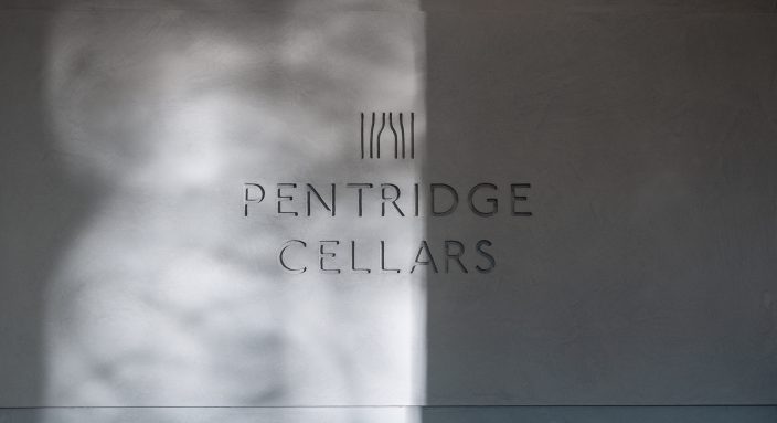
The brandmark depicts the bars of a prison cell bent into the shape of a wine bottle and, paired with the campaign line \"Great wine belongs behind bars\", strikes the perfect balance of modern luxury and a grand, intriguing history.

Everything from the marketing collateral to the signage and website supports this balance, communicating directly to wine collectors and positioning Pentridge Cellars as the next exclusive drop to add to their collection.

Design Impact

Pentridge Cellars themselves have said:

"The final branding is something that Michael and I are very proud of, it fulfils all that we are as a business. Our identity has been very well received by customers and suppliers alike, it exudes both an old and new world, intertwining them much better than we could have hoped."

Design Transformation

To sell a luxury brand, one must be luxurious themselves. Pentridge Cellars now embody the premium experience they promise others, ensuring their entry to the market is a strong, unique and memorable one.

Design Innovation

Pentridge Cellars are utterly unique, and we knew that harnessing this exclusivity would be key to the success of the project. We decided that the concept and all output needed to be luxurious but with an added depth of mood and gravitas.

Signage, site staging and styling, and photography were all carefully designed to embody this sophisticated moodiness. Collateral was printed on duplexed, stone-hued papers, reflecting the historic nature of the site, and luxury print finishes such as sculpted logo embossing, glossy black foil stamps, custom forme-cut folders and singer-sewn brochure spines reflect the premium craftsmanship of the cellars themselves.

Communication Design 2019 Finalists

Flinders Street Station Digital Displays

Meld Studios / Public Transport Victoria (PTV)

INTER-DREAM

PluginHUMAN (Justin Dwyer and Betty Sargeant)

Sans Forgetica

Letterbox / RMIT Behavioural Business Lab / RMIT School of Design

Metro Tunnel Creative Program and The Huxleys

Rail Projects Victoria / Cross Yarra Partnership / The Huxleys / The Place Agency / Melbourne Fashion Week

Escher x Nendo: Between Two Worlds

National Gallery of Victoria / nendo

Pretty Little Things

Metro Tunnel Creative Program / The Cutaway / The Place Agency

The Bloody Good Dinner—The Fire One

Town Square / Hart & Co.

Ntaria Design

Nicola St John / Ntaria Design

Setting the Pace for Spicers

Liquorice / Spicers

Gut Feelings

Museums Victoria