Best in Category - Design Strategy 2014

Quirkii Paper Products

Jalapeno Creative / Ausinc

An existing range of paper, transfer, magnet product was rebranded to increase sales and aesthetic appeal.

An existing range of paper/transfer/magnet product was rebranded to increase sales and aesthetic appeal. As Officeworks has a broad customer base, the design could not be seen to target one demographic in particular. There has been an increase on like for like sales of 30% the only change to the products was the packaging, the price and quantity remained the same.

Design Excellence

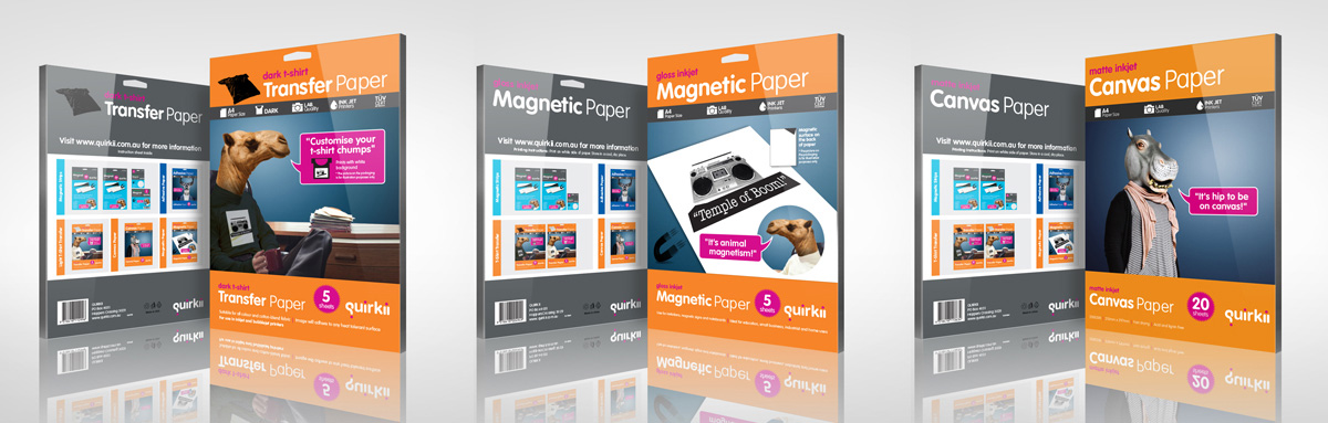
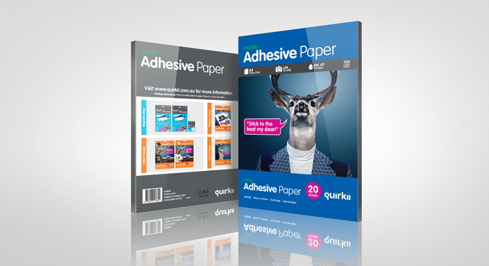
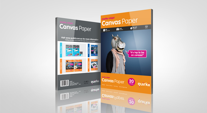
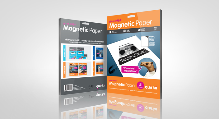
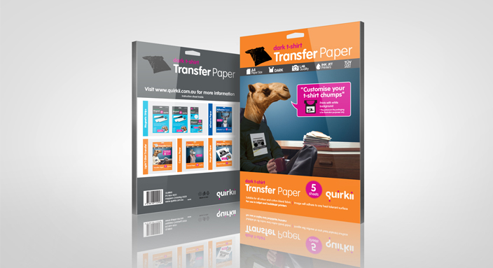
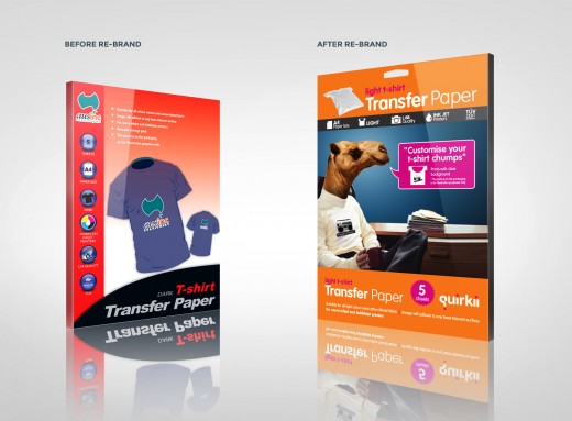
We looked at the market and the competition. The packaging was all the same really. Red, white, blue, yellow. Family or holiday stock photography. Safe, safe, safe. We took what was there and turned it on it’s head. We gave the range a tone of voice and personality that visually stands out from competing brands and market leaders in the form of cheesy puns and recognisable zoo animals.

The clients market share has increased with the extra sales over the competitors. The designs are bringing a fun element to the products that was missing in the past.

Design Impact

A a key supplier to one of Australia’s largest stationery retailers, Ausinc came to us looking to increase sales of their specialty paper range in store.

The design restraints were that:

  • The product offer and price point were to remain the same
  • The product was to compete against market leaders in store as well as readily available cheap specialty printing options online
  • Reintroduce the idea of home specialty printing i.e. t-shirt transfers, printed magnets and print on canvas using your home printer

Make it fun.
To do this we needed to analyse the competition in store and online and give the brand a different voice in the category with a complete overhaul.

Design Transformation

As there is a broad customer base for the product, the design could not be seen to target one demographic in particular. This explained the competition. It was safe, generic and boring with corporate tones of white, blue, yellow and red. Family or holiday stock photography. Safe, safe, safe. And here lay our opportunity to be different. Bring the fun back into a product that is supposed to be creative.

Design Innovation

The product line, cutting moulds, product weight and shipping requirements had to remain the same to avoid additional costs to the client during the printing and shipping process. The boost in product sales was to be delivered on branding alone. After many iterations of naming conventions and branding tweaks, Quirkii was born, bringing with it, a cheeky tone of voice and personality. It stood out on the shelf with pop colour and fresh imagery and using cheesy puns to get a giggle. Online the products remain true to their new identity and visually differentiate themselves amongst the competition just as well as they do in store.

Other Key Features

There has been an increase on like for like sales of 30% with an increase in product enquiries both online, over the phone and in store. The product even scored a gig on the show House Husbands.